
Two-Toned Kitchen Cabinets: A Modern Design Revolution
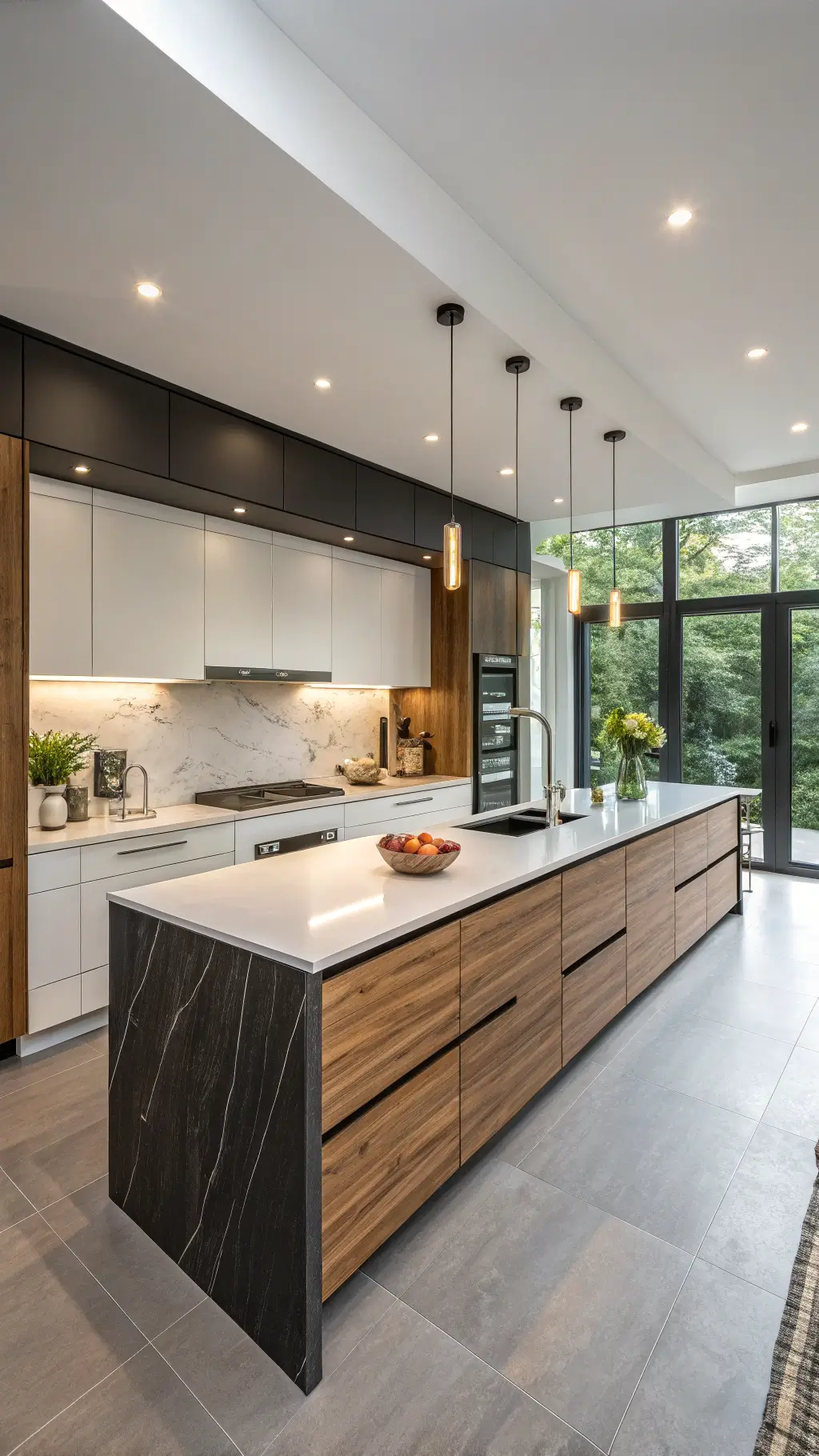
Two-toned kitchen cabinets are transforming kitchen design, offering a bold and sophisticated approach to interior styling. This design trend breaks the monotony of traditional single-color cabinetry, injecting personality and visual depth into your culinary space.
🎨 Steal This Look
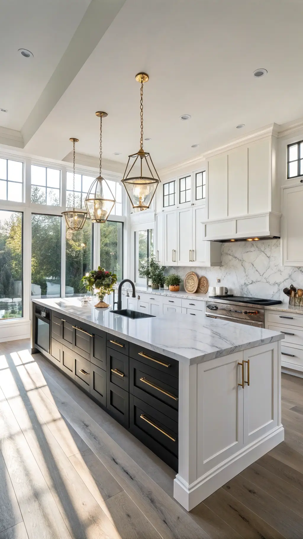
- Paint Color: Sherwin-Williams Urbane Bronze SW 7048 for lower cabinets with Sherwin-Williams Alabaster SW 7008 for upper cabinets, creating classic two-toned contrast
- Furniture: Contrasting kitchen island with one tone differing from perimeter cabinets; matching bar stools with upholstered seats in complementary neutral or metallic finish
- Lighting: Pendant lights with brushed brass or matte black hardware suspended over island, sized proportionally to cabinet sections
- Materials: Shaker-style cabinet doors with soft-close hinges, quartz or marble countertops, matte or satin cabinet hardware in complementary metal finish
Two-toned cabinetry is the modern kitchen’s answer to monochromatic fatigue—it’s bold enough to feel designed, but structured enough to remain timeless. This approach lets you embrace color without overwhelming a hardworking space.
Why Two-Toned Cabinets Are a Game-Changer
Let’s cut to the chase. Two-toned cabinets aren’t just a passing trend – they’re a strategic design choice that solves multiple kitchen challenges:
Visual Magic Makers:
- Create instant visual interest
- Break up monotonous kitchen layouts
- Add dimension without major renovations
Space Transformation Tricks:
- Light upper cabinets make rooms feel larger
- Dark lower cabinets ground the space
- Optical illusions that actually work
🖼 Steal This Look
- Paint Color: Benjamin Moore Chantilly Lace OC-17 for upper cabinets paired with Benjamin Moore Hale Navy HC-80 for lower cabinets
- Furniture: White or light oak kitchen island paired with dark lower cabinetry; open shelving with warm wood tones on upper walls
- Lighting: Recessed can lights with warm 3000K bulbs positioned to highlight upper cabinet interiors; pendant lights in brushed brass over island for contrast
- Materials: Soft-close cabinet hardware in brushed nickel or matte black; quartz or marble countertops in neutral tones; natural wood or matte finish on drawer fronts
Two-toned cabinets work because they speak a language your eye already understands—light and dark, open and grounded, visual breathing room with anchoring weight. This design choice makes kitchens feel intentionally curated rather than default.
Color Combos That Wow
Neutral Neutralizers
- White + Black: The ultimate classic combo
- Gray + White: Sleek and sophisticated
- Khaki + Cream: Subtle elegance personified
Bold and Beautiful
- Teal + White: Splash of drama
- Sage Green + Warm Wood: Nature-inspired harmony
- Navy + Natural Wood: Modern meets organic
💡 Steal This Look
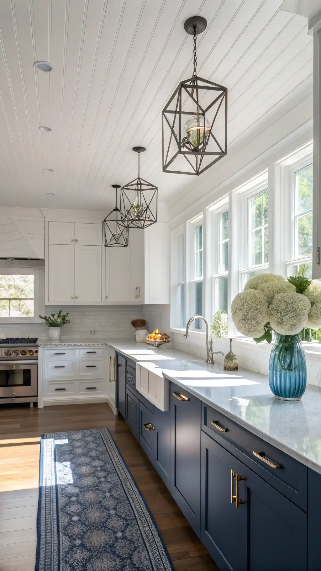
- Paint Color: Farrow & Ball Cornforth White 228 for base cabinets paired with Farrow & Ball Hague Blue 30 for upper cabinets (Navy + Natural Wood combo)
- Furniture: Natural wood kitchen island with warm honey or walnut finish; open shelving in matching natural wood to display dishes and cookbooks
- Lighting: Brushed brass or natural wood pendant lights suspended over island; warm Edison bulbs to complement wood tones
- Materials: Matte or satin cabinet finishes; natural wood grain visible on island or open shelving; brass or warm metal hardware; light wood countertops or butcher block
Two-toned cabinets are the perfect compromise between safe neutral design and personal style—they let you honor a classic color combo while creating visual interest and defining distinct kitchen zones. This approach feels intentional and curated rather than matchy-matchy.
Pro Design Tips for Killer Two-Tone Looks
Placement Matters:
- Lighter colors on top
- Darker tones on bottom
- Island as a strategic color statement
Texture Talk:
- Mix painted finishes
- Incorporate wood tones
- Create visual layers
🎨 Steal This Look
- Paint Color: Behr Whisper White N520-1 for upper cabinets, Behr Dark Space 790F-7 for lower cabinets and island
- Furniture: Stainless steel kitchen island with seating for 3-4, open shelving above island in contrasting finish
- Lighting: Pendant lights suspended over island in brushed brass or matte black, one fixture per 2-3 feet of island length
- Materials: Matte finish paint for lower cabinets to ground the space, satin finish for upper cabinets, natural wood open shelving or wood-grain island top, hardware in oil-rubbed bronze or brushed nickel
Two-tone kitchens have staying power because they balance visual interest with timelessness. The key is treating your island and lower cabinets as anchors that ground the space while lighter uppers keep it feeling open and airy.
The Real Pros and Cons
Pros:
- Incredible design flexibility
- Increases visual square footage
- Adds serious resale value
- Reflects personal style
Cons:
- Requires careful color planning
- Potential higher design costs
- Risk of looking trendy vs. timeless
🌟 Steal This Look
- Paint Color: Valspar Alabaster 7008 and Valspar Iron Ore 5009 — classic two-tone pairing that balances light uppers with sophisticated darker lowers
- Furniture: Stainless steel kitchen island with waterfall countertop edge; open shelving on upper cabinets to showcase dishes and decor
- Lighting: Brushed nickel pendant lights suspended 30-36 inches above island countertop; under-cabinet LED strip lighting in warm white (3000K) to highlight two-tone contrast
- Materials: Quartz or marble countertops; soft-close cabinet hardware in brushed or matte black; subway tile or shiplap backsplash in white to bridge the two cabinet tones
Two-tone cabinetry is one of the smartest design investments because it solves the biggest kitchen dilemma: do I go bold or safe? This approach lets you do both at once, making your space feel intentional and curated rather than indecisive. The resale bump is real—buyers see sophistication and thoughtful design immediately.
Practical Wisdom
Key Considerations:
- Choose durable paint finishes
- Consider long-term home value
- Balance lighting carefully
- Coordinate with existing design elements
🎨 Steal This Look
- Paint Color: PPG Timeless Creams TC-15 for cabinet bases with PPG Ultra Pure White UL100 for upper cabinets
- Furniture: Solid wood kitchen island with mixed wood tones, stainless steel appliances, open shelving for display pieces
- Lighting: Recessed LED downlighting with warm color temperature (3000K) paired with pendant lights over island workspace
- Materials: Matte or satin cabinet finishes for durability, quartz or granite countertops, subway tile or shiplap backsplash in neutral tones
Two-toned cabinets are a smart middle ground between a complete overhaul and playing it safe with one color. When balanced thoughtfully with your kitchen’s bones, they add visual interest and sophistication without overwhelming the space or dating your home’s resale value.
Who Can Pull This Off?
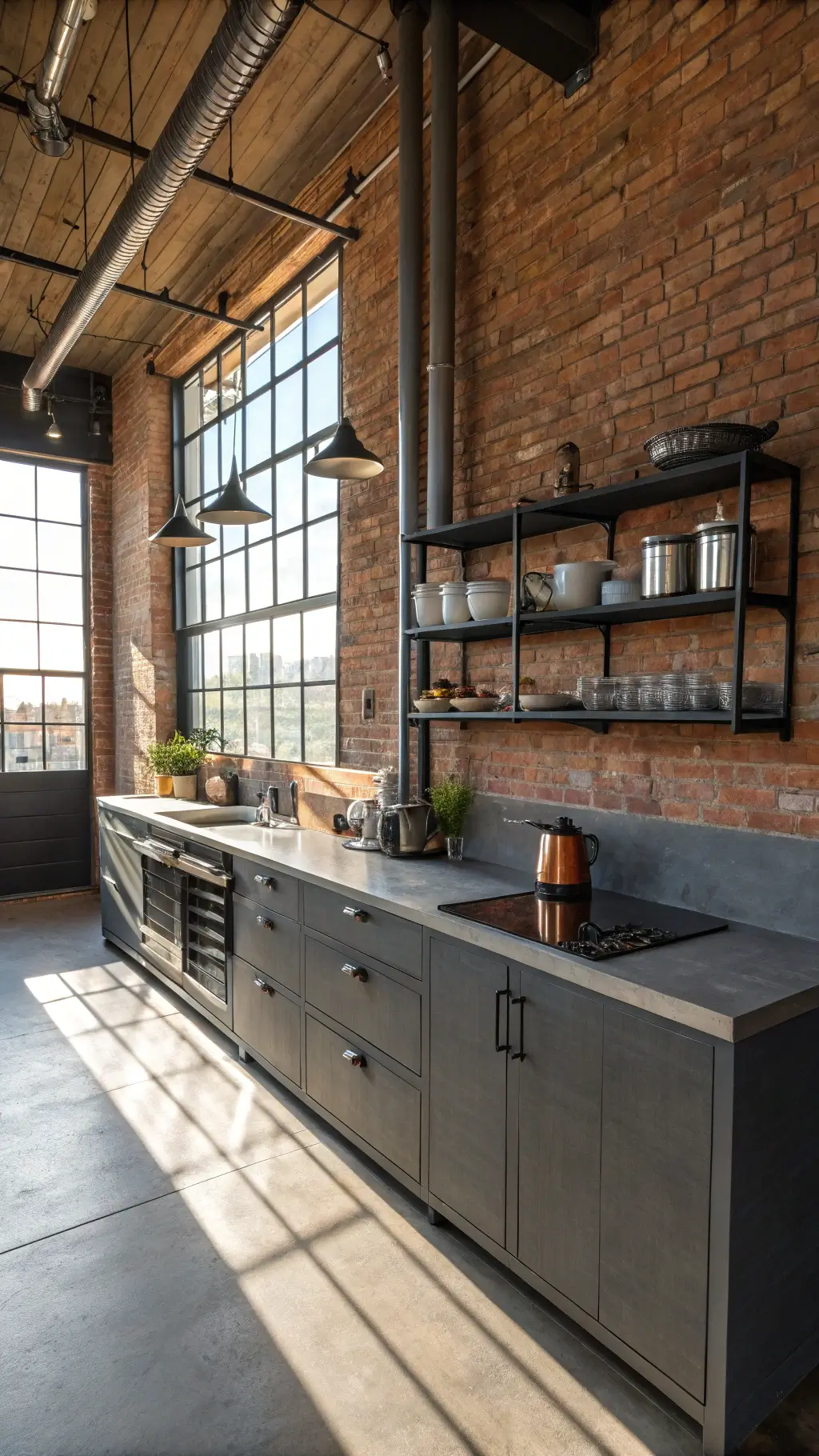
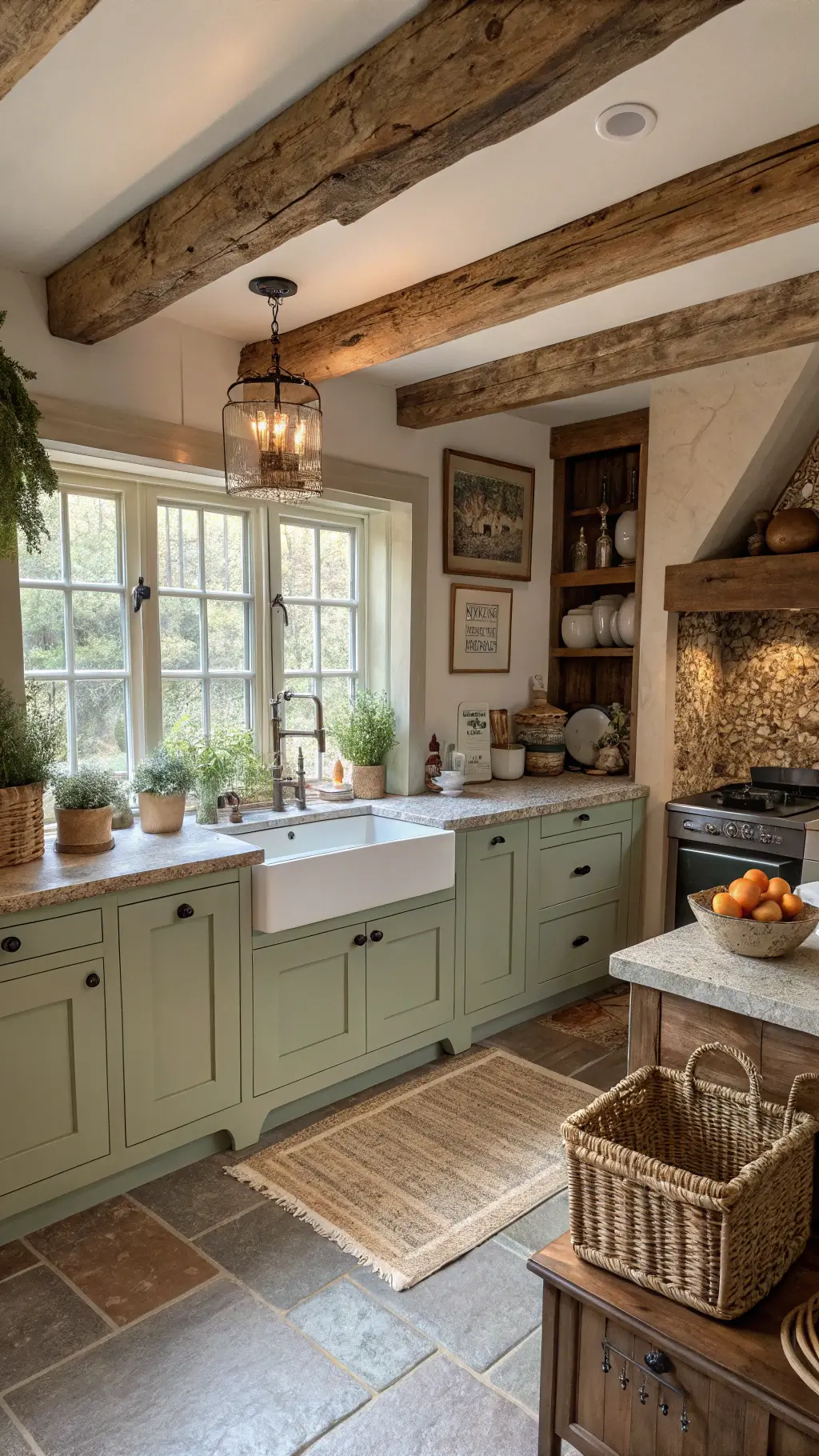
Two-tone cabinets aren’t just for design pros. They work across:
- Modern kitchens
- Farmhouse styles
- Coastal designs
- Industrial spaces
- Transitional layouts
✎ Steal This Look
- Paint Color: Dunn-Edwards Eggshell DE6259 for upper cabinets paired with Dunn-Edwards Urbane Bronze DE6307 for lower cabinets
- Furniture: Stainless steel bar stools with wooden seats, open shelving in natural wood tones, white subway tile backsplash
- Lighting: Brushed nickel or matte black pendant lights suspended above island or counter space
- Materials: Mixed metal hardware in brushed nickel and black, butcher block or quartz countertops, subway or shiplap backsplash elements
Two-tone cabinets give any kitchen personality and sophistication without the expense of a full renovation—they work whether you’re embracing modern minimalism or cozy farmhouse charm. This approach proves that bold kitchen design isn’t gatekept by professional designers or large budgets.
Final Design Philosophy
Two-toned cabinets are more than a trend – they’re a design strategy. They transform kitchens from functional spaces into personal statements.
Pro Tip: When in doubt, stick to neutral palettes that offer timeless appeal and maximum flexibility.
Want to make your kitchen pop? Two-toned cabinets are your secret weapon.


