
Red Kitchen Cabinets: A Bold Design Choice That Actually Works
I’ve spent years helping homeowners transform their kitchens, and let me tell you – red cabinets are having their moment!
🎨 Steal This Look
- Paint Color: Sherwin-Williams Alabaster SW 7008
- Furniture: Natural wood or black metal kitchen island with waterfall countertop edge; open shelving with brass or matte black brackets
- Lighting: Pendant lights with brass or oil-rubbed bronze fixtures; recessed lighting for task work above countertops
- Materials: Polished or honed quartz countertops, subway tile or shiplap backsplash, brushed brass hardware, concrete or light wood flooring
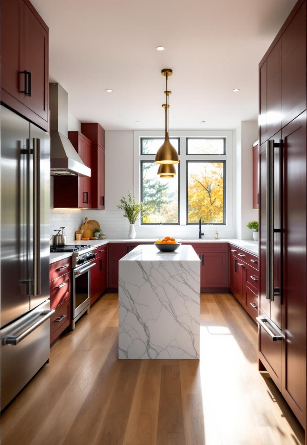
Red kitchens have evolved from dated to design-forward – the key is treating them as the hero of the room rather than trying to hide them. When balanced with clean lines, good lighting, and neutral surroundings, red cabinets signal confidence and sophistication.
Why Consider Red Cabinets?
Listen, I get it. Red cabinets sound intimidating. But here’s the truth:
- They create instant wow-factor
- Add warmth and energy to any space
- Work surprisingly well with most design styles
- Can increase your home’s resale value (when done right)
🏠 Steal This Look
- Paint Color: Benjamin Moore Caliente AF-290
- Furniture: Stainless steel kitchen island with butcher block or marble countertop, modern bar stools with metal frames, open shelving with black metal brackets
- Lighting: Pendant lights with brushed brass or matte black fixtures over kitchen island, recessed lighting in ceiling, under-cabinet LED strip lighting
- Materials: Matte or satin-finish cabinet paint, quartz or marble countertops, subway or herringbone backsplash in white or cream, brushed stainless steel hardware
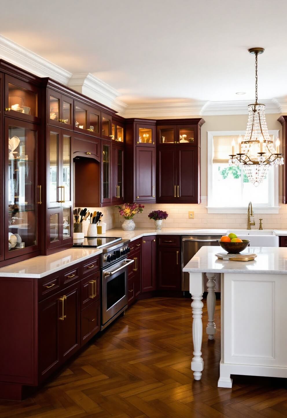
Red kitchens demand confidence, but they deliver unmatched personality and warmth. When you commit to the color, you’re not just updating a kitchen—you’re creating a space that feels intentional, energetic, and undeniably memorable.
Finding Your Perfect Red
Not all reds are created equal! Here’s what I recommend:
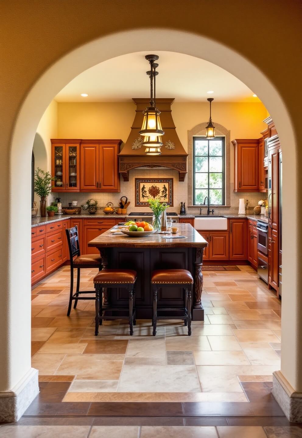
- Burgundy – Perfect for traditional spaces
- Cherry red – Great for modern kitchens
- Barn red – Ideal for farmhouse style
- Coral red – Brings warmth without overwhelming
💡 Steal This Look
- Paint Color: Farrow & Ball Red Earth 64
- Furniture: Stainless steel kitchen island with butcher block countertop, open shelving in natural wood, white or cream painted upper cabinetry to balance red lower cabinets
- Lighting: Pendant lights with brushed brass or matte black fixtures suspended over kitchen island
- Materials: Glossy or semi-gloss cabinet finish for durability, marble or granite countertops, subway tile or shiplap backsplash
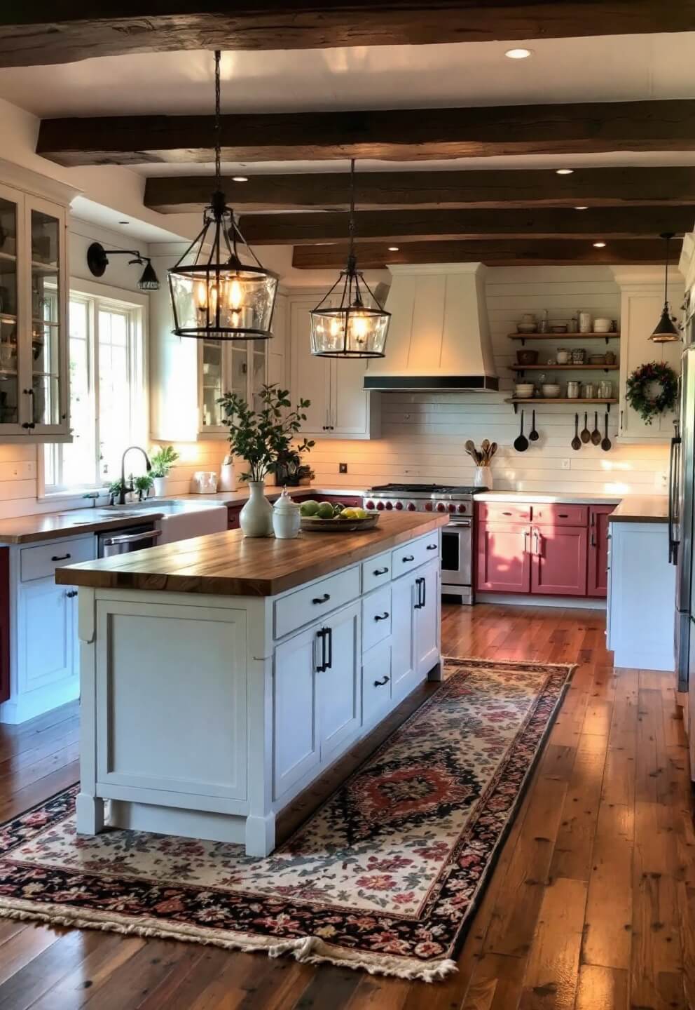
Red kitchen cabinets are bold and unapologetically personal—they signal confidence and warmth. The right shade transforms a kitchen from merely functional to genuinely memorable, making every meal feel like an occasion.
The Magic of Mixing Colors
Here’s my foolproof formula:
- 60% dominant color (walls/floors)
- 30% red cabinets
- 10% accent pieces
Best Color Combinations:
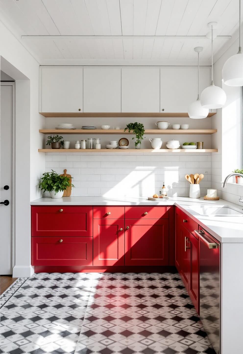
- Red + White = Classic and clean
- Red + Gray = Sophisticated modern
- Red + Black = Bold and dramatic
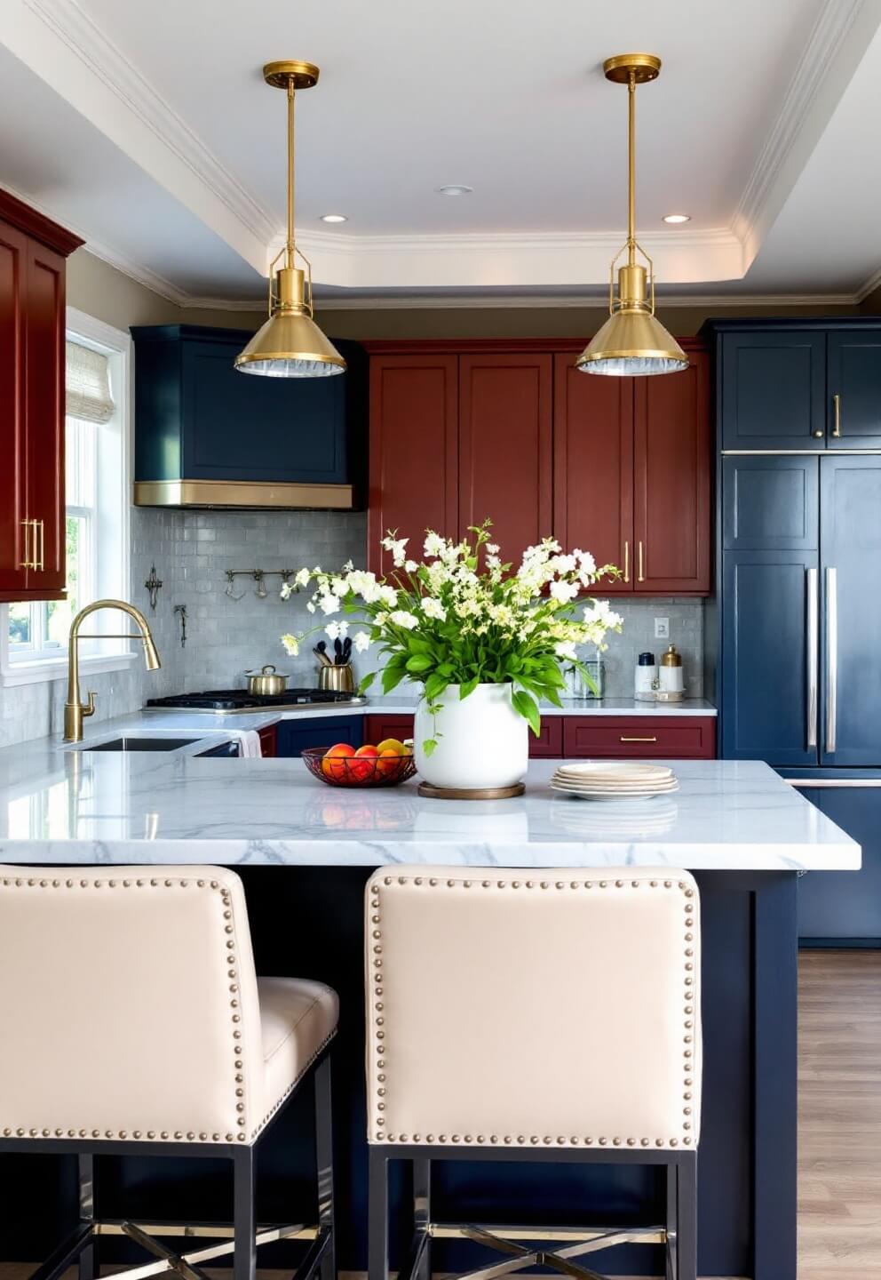
- Red + Navy = Unexpected but gorgeous
🌟 Steal This Look
- Paint Color: Behr Polar Bear ECC-10-1 for walls to create clean contrast with red cabinets, or Behr Burnished Slate N520-7 for sophisticated gray backdrop
- Furniture: White shaker-style kitchen island with butcher block countertop, or gray-painted base cabinets with open shelving
- Lighting: Brushed nickel or chrome pendant lights over island to complement red cabinet hardware without competing
- Materials: Stainless steel appliances, white subway tile or soft gray quartz backsplash, matte black or polished chrome hardware on red cabinets
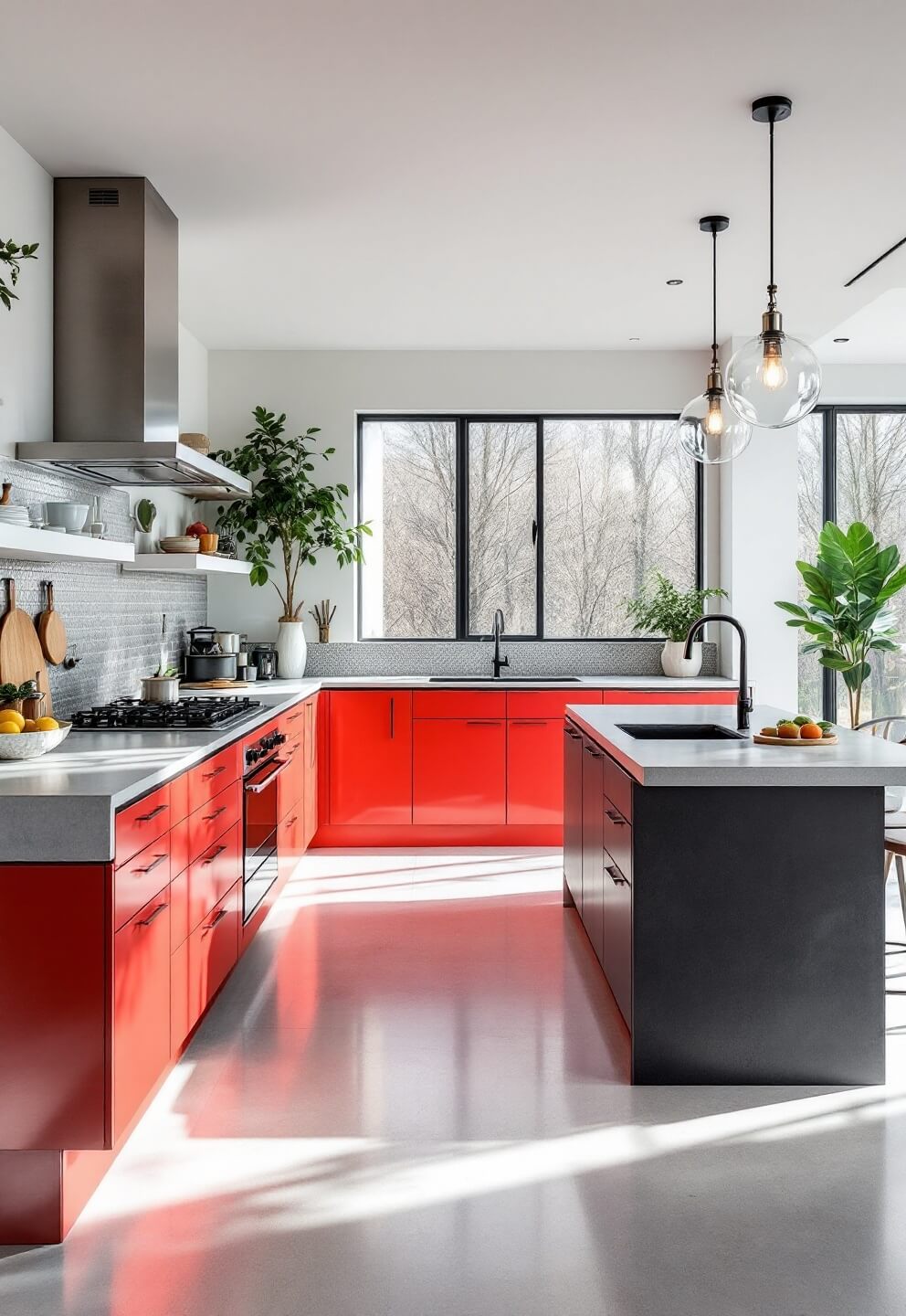
The 60-30-10 color formula transforms red cabinets from potentially overwhelming into a confident design anchor. This mathematical approach removes guesswork and gives you permission to go bold with cabinet color because the supporting palette keeps the kitchen feeling controlled and curated.
Smart Design Tips
I always tell my clients:
- Start small – Maybe just the island or lower cabinets
- Balance with neutrals
- Use matte finishes to avoid overwhelming shine
- Add metal hardware for dimension
💡 Steal This Look
- Paint Color: Valspar Creamy Mushroom 7006-4 — a soft neutral backdrop that lets red cabinets be the star without competing
- Furniture: Neutral upholstered bar stools with turned wood legs; natural wood dining table to ground the bold cabinet color
- Lighting: Brushed brass or matte black pendant lights over the island to add metallic dimension without chrome shine
- Materials: Matte finish cabinetry, natural wood countertops or concrete, brushed metal hardware in aged brass or oil-rubbed bronze
Red kitchens command attention, but restraint makes them work. Starting small with just the island gives you confidence before committing to full cabinetry, and the neutrals around them ensure your bold choice feels curated rather than impulsive.
Lighting Matters
Your red cabinets need proper lighting:
- Natural light – Helps show true color
- Under-cabinet lighting – Creates depth
- Pendant lights – Adds visual interest
🎨 Steal This Look
- Paint Color: PPG Urbane Bronze PPG1012-7
- Furniture: Kitchen island with neutral wood or white base to contrast red cabinetry
- Lighting: Brushed brass or matte black pendant lights (3-light cluster) positioned 30-36 inches above kitchen island or counter
- Materials: Warm brass hardware on cabinets, frosted glass or metal shades for pendants, under-cabinet LED strips with warm white 3000K color temperature
Red kitchens demand strategic lighting to shine—without it, they can feel cave-like despite their bold color. Layered lighting transforms red cabinets from intimidating to inviting, letting the color work *for* you rather than against your space.
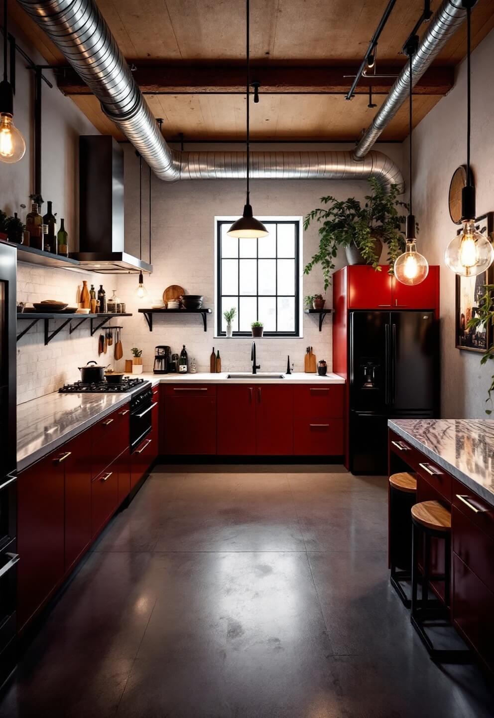
Real Talk: Maintenance
Let’s be honest about upkeep:
- Fingerprints show more on red
- Regular dusting is essential
- Touch-ups may be needed more often
- Quality paint/stain is worth the investment
🎨 Steal This Look
- Paint Color: Dunn-Edwards Ravishing Red DE 5083
- Furniture: Kitchen cabinetry with durable polyester or polyurethane finish (semi-gloss or high-gloss recommended for red kitchens)
- Lighting: Recessed LED downlighting with dimmer capability to reduce glare on red cabinet surfaces
- Materials: High-gloss polyurethane or conversion varnish cabinet coating, stainless steel hardware, tempered glass backsplash (fingerprint-resistant)
Red cabinets make bold statements, but they demand respect in the maintenance department. The good news? High-quality finishes actually age beautifully and touch-ups blend seamlessly with proper application.
Common Mistakes to Avoid
Trust me, I’ve seen it all:
- ✗ Going too bright
- ✗ Skipping samples
- ✗ Matching everything to the red
- ✗ Poor lighting placement
🖼 Steal This Look
- Paint Color: Clare Paint Brick Red CODE BR-05 for kitchen cabinets paired with Benjamin Moore Cloud White HC-130 for walls to prevent overwhelming brightness
- Furniture: Stainless steel bar stools with natural wood seats, open shelving in black metal frames, white quartz or butcher block countertops
- Lighting: Recessed LED downlights (3000K warm white) combined with adjustable pendant lights over island to avoid harsh shadows on red cabinetry
- Materials: Matte or satin finish cabinet paint rather than gloss, brushed nickel or matte black hardware, natural wood accents to balance red intensity
Red kitchens are bold and dramatic, but the fear of ‘too bright’ kills so many beautiful designs before they start. The real mistake isn’t the red itself—it’s not testing the specific shade in your light, and then trying to force every other element to match rather than letting red be the hero while everything else grounds the space.
The Bottom Line
Red kitchen cabinets aren’t for everyone, but when done right, they’re absolutely stunning. Start with quality materials, choose your shade carefully, and don’t be afraid to experiment with different combinations.
Remember: Your kitchen should make you smile every time you walk in. If red cabinets do that for you, go for it!
✎ Steal This Look
- Paint Color: Fine Paints of Europe Pompeii Red 10YR 21/575 (for walls complementing red cabinets; pair with Fine Paints of Europe Cloud White 10YY 83/013 for trim and ceiling to let cabinetry command attention)
- Furniture: Kitchen island with contrasting wood or white painted base to ground the bold cabinetry; bar stools in natural wood or metal with neutral upholstery
- Lighting: Brushed brass or oil-rubbed bronze pendant lights above kitchen island—metals that warm against red cabinet tones without competing for visual focus
- Materials: Honed marble or light quartz countertops to balance red’s intensity; natural wood open shelving or stainless steel hardware for tactile contrast
Red kitchens signal confidence and personality—they’re for homeowners willing to commit to a bold vision rather than play it safe. The joy comes from waking to a space that feels unmistakably yours, not like a rental or catalog spread.


