Creating a Moody Kitchen: A Designer’s Guide to Dark and Dramatic Spaces
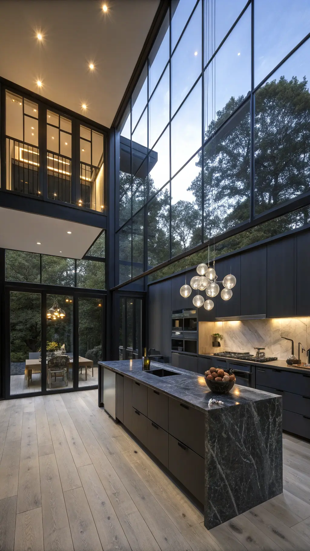
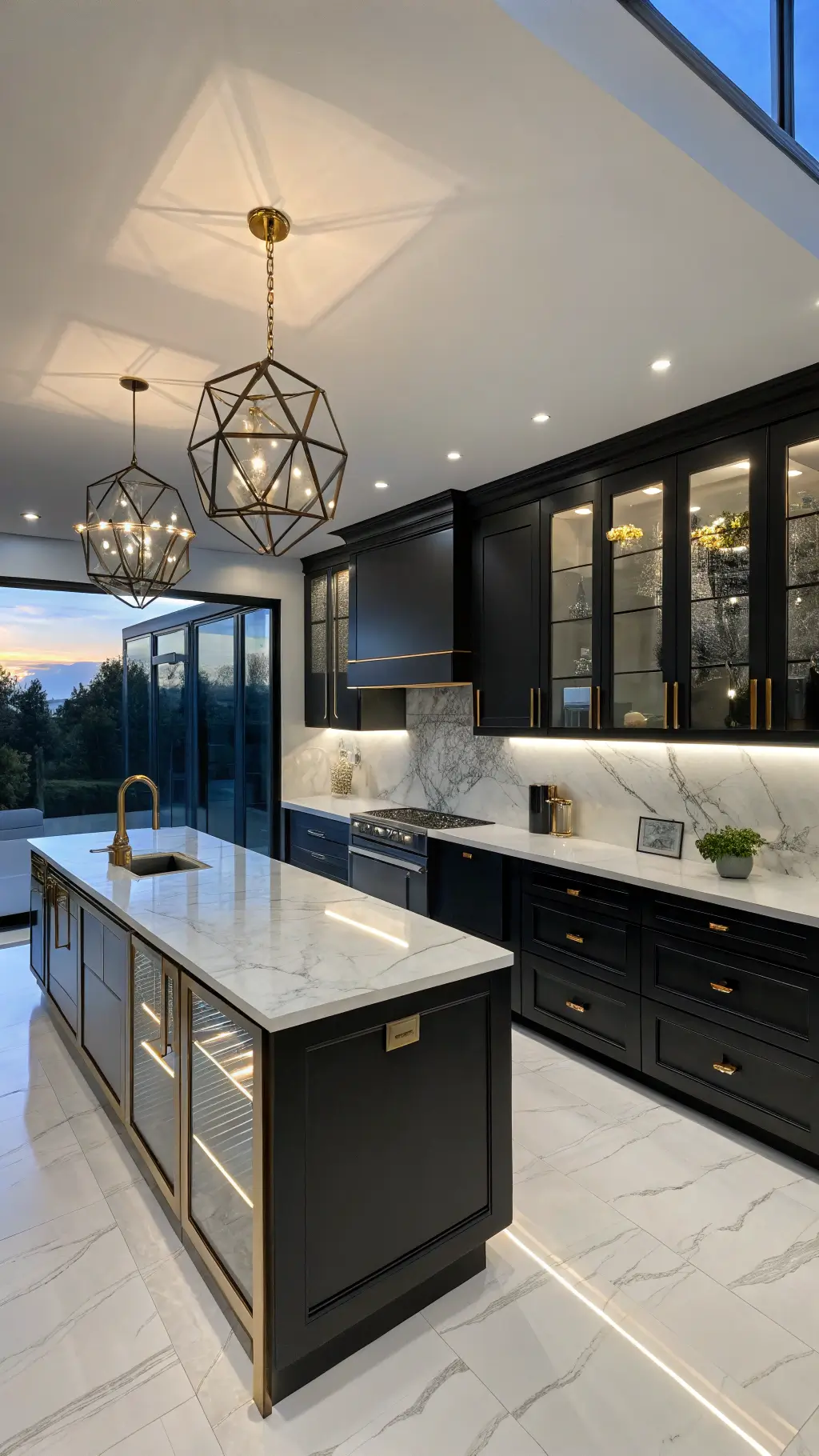
A moody kitchen is really a lighting plan first. I set the dark surfaces, then build the glow with under-cabinet and low fixtures so the room feels enveloping at night.
🖼 Steal This Look
- Paint Color: Sherwin-Williams Urbane Bronze SW 7048
- Furniture: Deep charcoal or black kitchen island with waterfall edge countertop, matte black cabinetry, dark wood open shelving
- Lighting: Brass or matte black pendant lights with warm Edison bulbs (2700K), under-cabinet LED strips in warm white
- Materials: Matte black hardware, dark granite or charcoal quartz countertops, black metal frames, deep stained wood shelving, concrete or dark tile flooring
A moody kitchen isn’t about being dark and depressing—it’s about creating sophistication and intimacy in a space where you start your day. The key is making dark drama feel intentional and luxurious, not like you’re cooking in a dungeon.
The Dark Side of Design: Choosing Your Colors
Want to know my go-to colors for a moody kitchen? Here’s what I swear by:
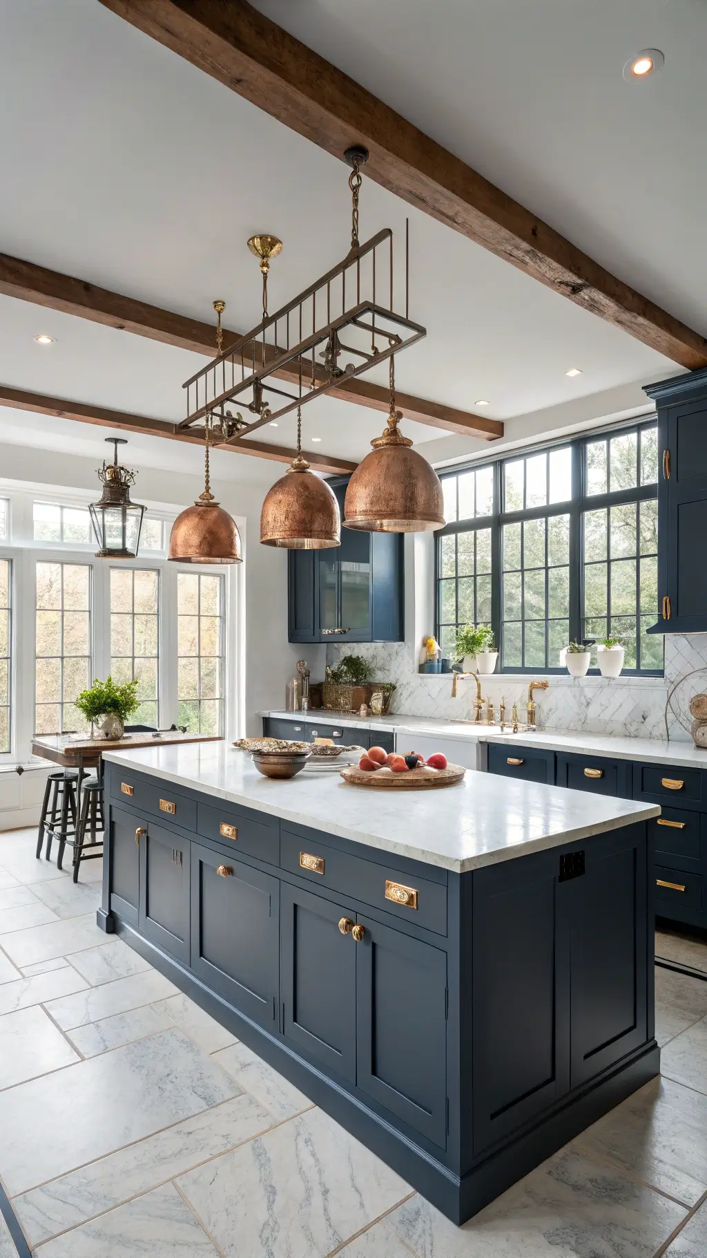
- Deep navy blues (my personal favorite is Benjamin Moore’s Hale Navy)
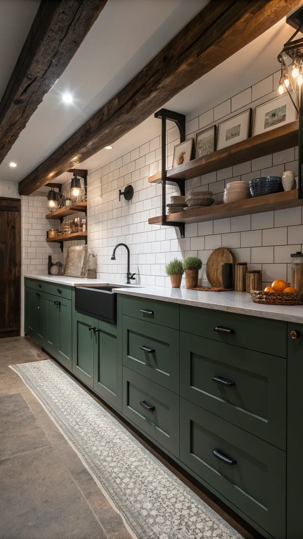
- Rich forest greens
- Dramatic charcoals
- Sophisticated blacks
Pro Tip: Don’t be afraid to paint your ceiling dark! It’s a game-changer that creates an incredibly cozy atmosphere.
💡 Steal This Look
- Paint Color: Benjamin Moore Hale Navy HC-154
- Furniture: Sleek kitchen cabinetry in matte black or deep navy with brushed brass or matte black hardware; minimalist open shelving in dark stained wood or charcoal
- Lighting: Warm brass or bronze pendant lights with frosted or amber glass shades suspended over kitchen island; recessed warm white LED downlights (2700K) to balance dark walls
- Materials: Matte finishes on cabinetry, natural stone countertops (dark granite or charcoal quartz), concrete or dark tile flooring, stainless steel appliances for contrast
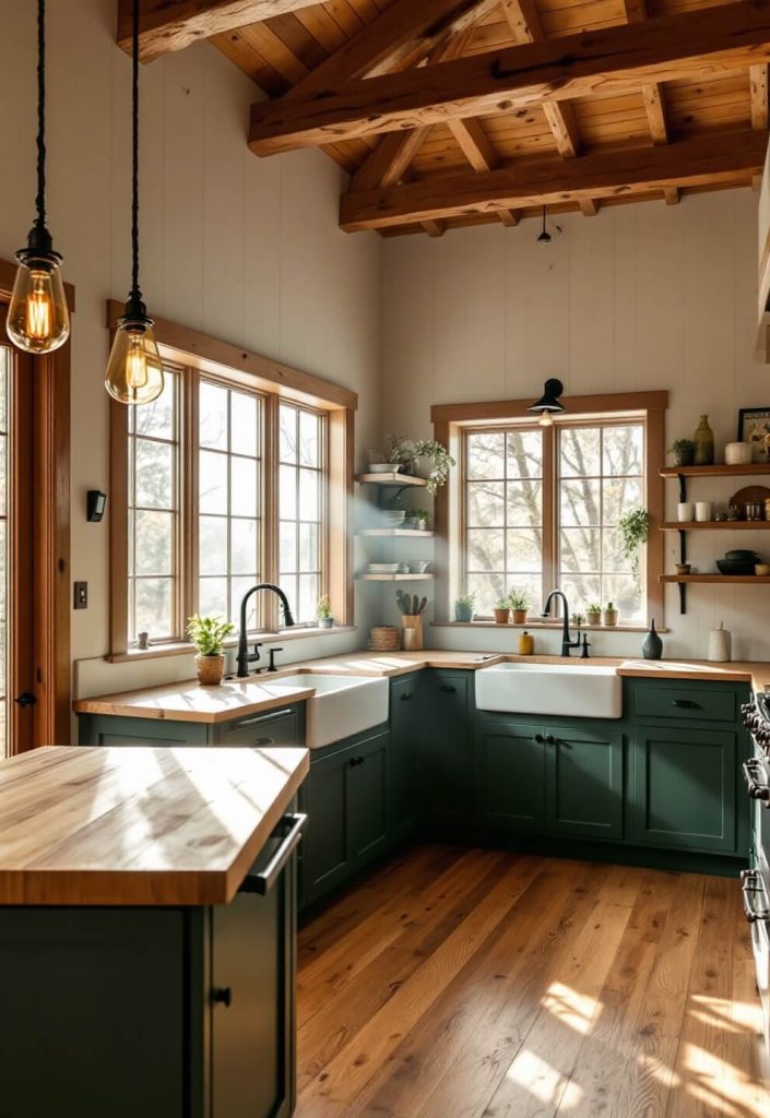
A moody kitchen isn’t about being dark and gloomy—it’s about creating a cocoon of sophistication and warmth. Deep navy, forest green, and charcoal are the most forgiving dark tones because they read as intentional design rather than grim.
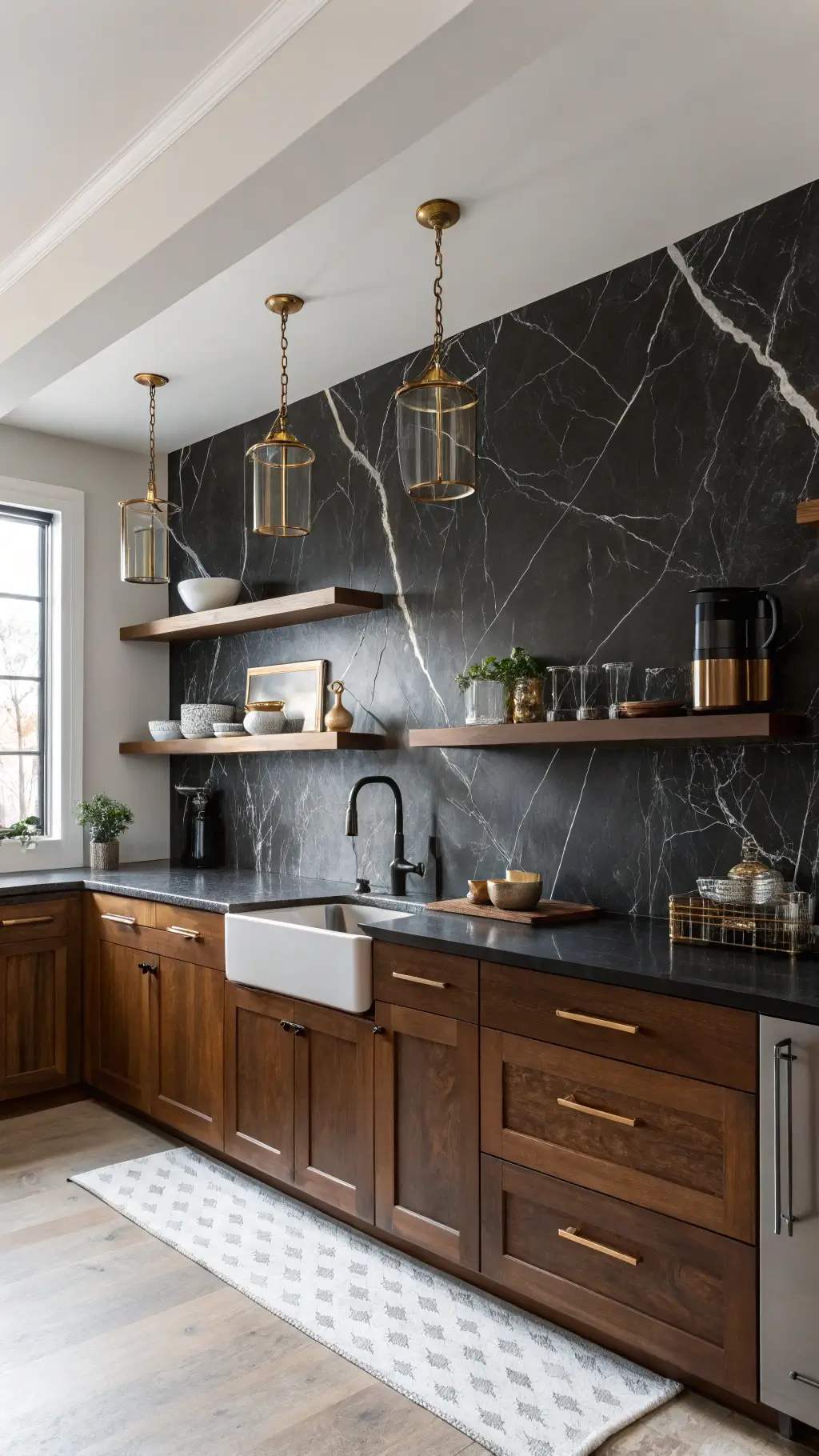
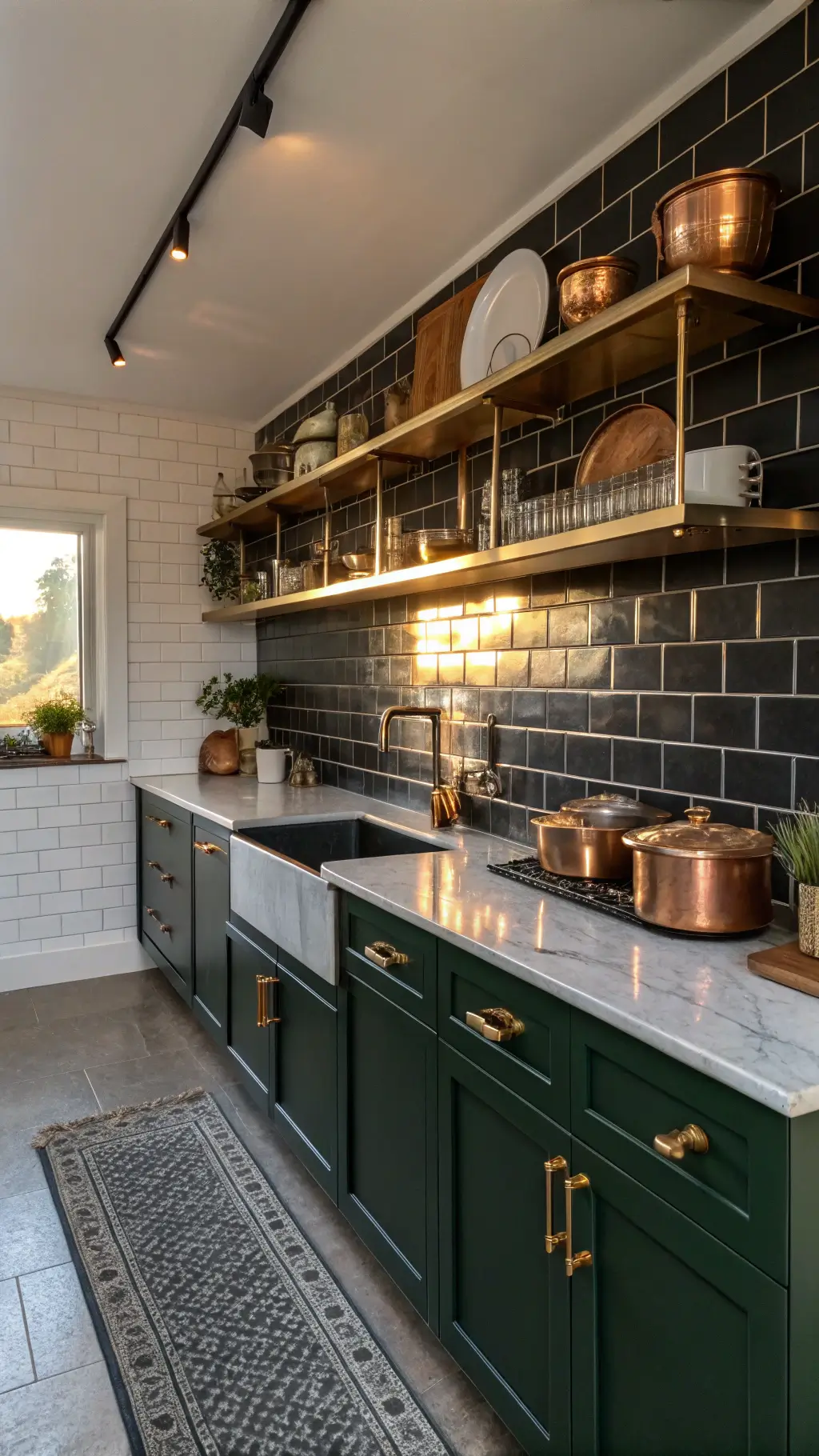
Material Magic: Textures That Tell a Story
Let’s talk textures – this is where the magic happens:
- Rough-hewn wooden beams
- Sleek marble countertops
- Matte black hardware
- High-gloss tile backsplashes
I recently completed a kitchen where we paired matte black cabinets with a glossy white marble backsplash – the contrast was absolutely stunning!
💡 Steal This Look
- Paint Color: Farrow & Ball Railings 31 – a sophisticated near-black that complements matte cabinetry while allowing marble to be the showstopper
- Furniture: Matte black kitchen cabinetry with slab-front doors, paired with a white marble-topped island featuring turned legs or sleek plinth base for contrast
- Lighting: Matte black pendant lights with frosted or clear glass shades hung above the island – the fixture material echoes cabinet hardware while glass brightens the space
- Materials: High-gloss white marble backsplash (Calacatta or Statuario), matte lacquered cabinet fronts, polished chrome or matte black stainless steel hardware, honed or leather-finish marble countertops for tactile variety
Material contrast is the secret language of moody kitchens. It’s not about picking one finish and committing to it everywhere; it’s about orchestrating a conversation between textures that prevents the space from feeling heavy or one-dimensional.
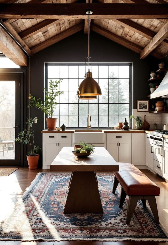
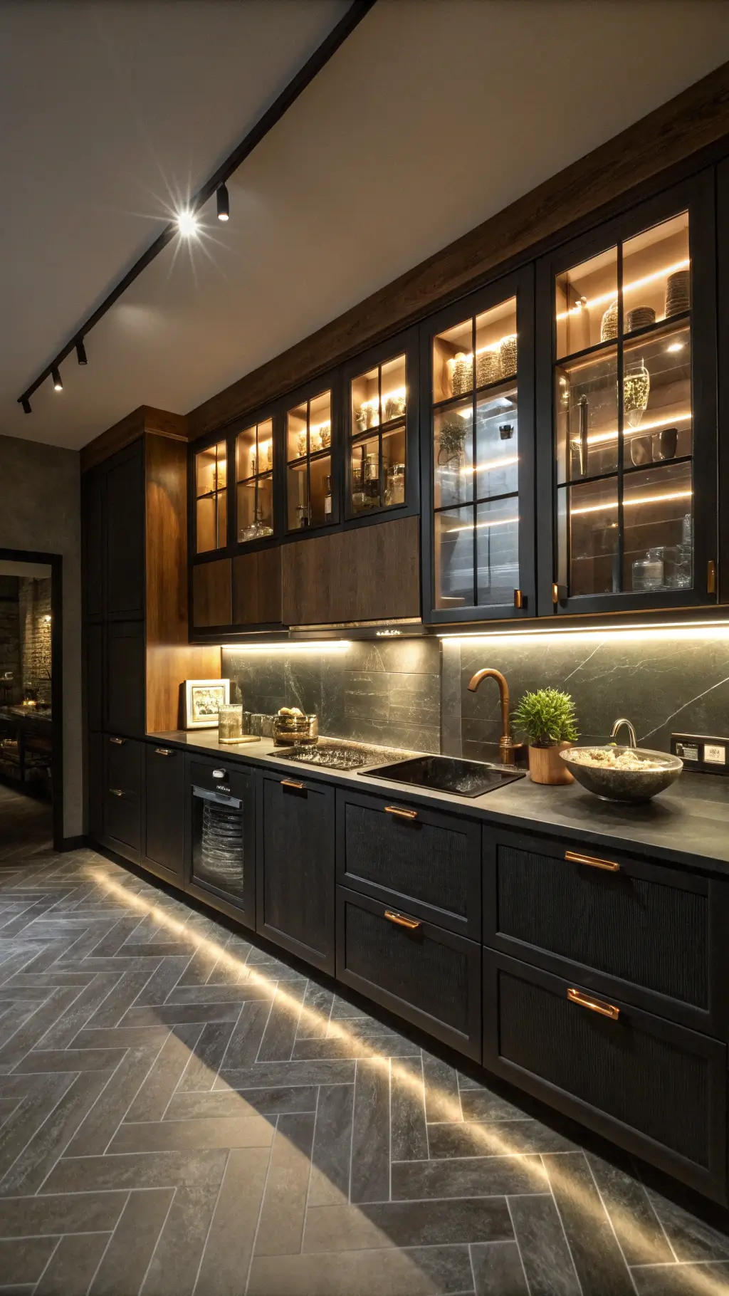
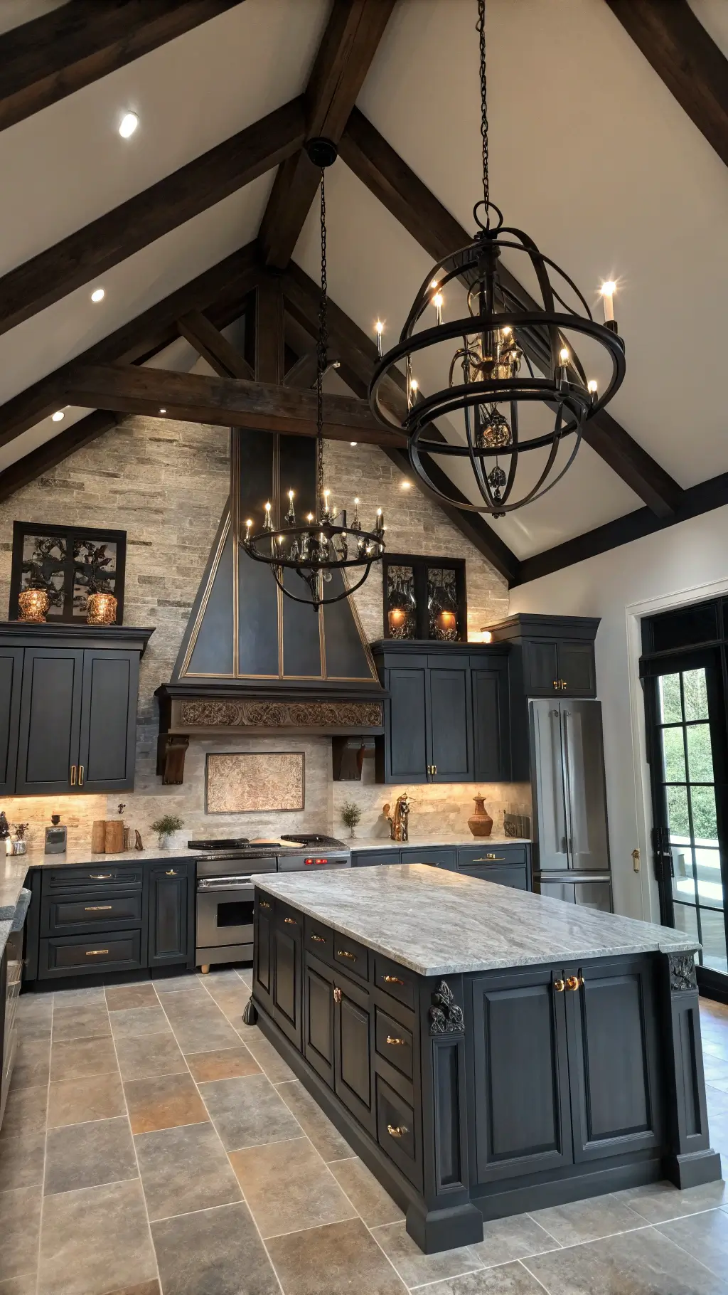
Lighting: The Secret Sauce
Here’s the thing about moody kitchens – lighting can make or break them.
Must-have lighting elements:
- Statement pendant lights over islands
- Under-cabinet LED strips
- Strategically placed sconces
- Dimmable overhead lighting
🏠 Steal This Look
- Paint Color: Behr Ultra Pure Black N520-10
- Furniture: Kitchen island with pendant light-friendly spacing, dark cabinetry with open shelving for ambient light layering
- Lighting: Industrial brass or matte black dome pendant lights (3-pack over island), dimmable LED under-cabinet strips (warm 2700K), brass or black sconces flanking range area
- Materials: Brushed metal fixtures, frosted glass diffusers, matte black hardware, warm brass accents for contrast
In a moody kitchen, lighting transforms from functional necessity to design storyteller. The right fixtures don’t just illuminate your countertops—they create the entire mood, highlighting textures and creating depth that makes the space feel intentional and restaurant-quality.
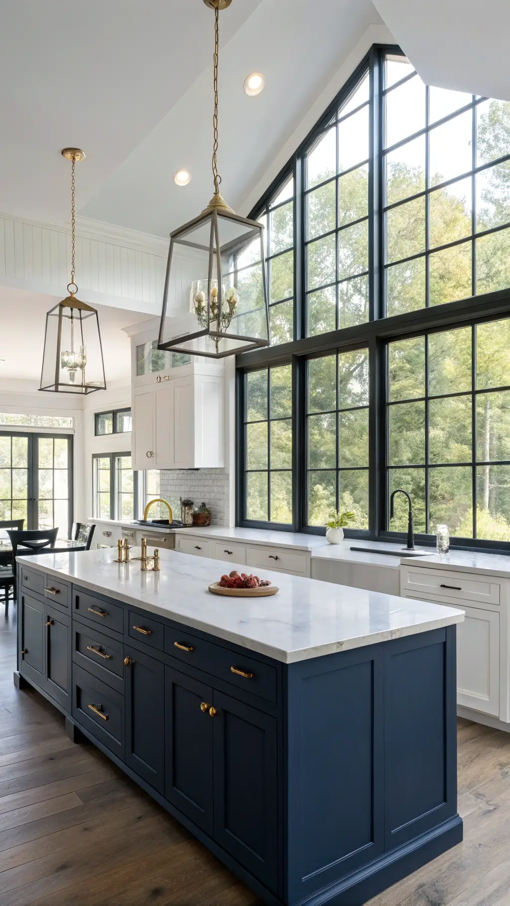
The Contrast Game
Trust me on this – you need contrast to prevent your kitchen from feeling like a cave.
My favorite contrast combinations:
- Dark cabinets + light countertops
- Moody walls + bright metallic fixtures
- Dark flooring + light ceiling details
🏠 Steal This Look
- Paint Color: Valspar Cavern Black 8006-7 for moody walls paired with Benjamin Moore Simply White PM-28 for ceiling details
- Furniture: Dark charcoal or black kitchen cabinetry with light quartz or marble countertops to create dramatic contrast
- Lighting: Polished brass or chrome pendant lights with geometric or modern fixtures to brighten moody spaces
- Materials: Matte black cabinetry, light marble or white quartz counters, dark concrete or slate flooring, brushed brass hardware accents
Moody kitchens thrive on tension – the drama comes from what’s fighting against the darkness, not from darkness alone. Those bright metallic fixtures aren’t just pretty; they’re your kitchen’s lifeline, creating visual relief and making the entire space feel intentional rather than gloomy.
Accessorizing Your Space
This is where you can really let your personality shine:
- Vintage copper pots
- Dark stoneware dishes
- Brass cabinet handles
- Rich wooden cutting boards
Designer’s Secret: Group accessories in odd numbers – it’s more visually appealing.
🌟 Steal This Look
- Paint Color: PPG Urbane Bronze PPG1002-7
- Furniture: Open shelving with dark wood or black metal frames to display accessories; a dark wood kitchen island or cart for grouping items
- Lighting: Brass or copper pendant lights with warm Edison bulbs (2700K) positioned over work surfaces or islands
- Materials: Aged brass, weathered copper, matte black metal, natural wood, stoneware ceramics, cast iron
A moody kitchen is the perfect canvas for showing off cherished vintage finds and heirloom-quality pieces. Thoughtful accessorizing transforms functional items into design elements that tell your story.
Practical Tips From My Experience:
- Always test paint samples in different lighting conditions
- Invest in quality cabinet hardware – you touch these every day
- Consider a mix of open and closed storage
- Don’t forget about task lighting for food prep areas
Remember: A moody kitchen doesn’t mean a gloomy kitchen. It’s all about creating depth, interest, and sophistication.
Want to dip your toes in first? Start with one dark accent wall or paint your island in a deep, rich color.
Moody design is a lighting plan first. Build the layers of warmth and the dark surfaces feel enveloping.
✎ Steal This Look
- Paint Color: Dunn-Edwards Urbane Bronze DE 6314 (for accent walls or island) or Dunn-Edwards Charcoal DE 6342 (for deeper moody tones)
- Furniture: Kitchen island with deep navy or charcoal cabinetry, open shelving units in black or dark wood, bar stools with upholstered seats for task areas
- Lighting: Recessed downlights with warm color temperature (2700K) over prep zones, pendant lights with dark metal fixtures over island for task lighting and visual depth
- Materials: Matte cabinet finishes (avoiding gloss for sophisticated feel), brushed brass or oil-rubbed bronze hardware, natural wood accents to prevent darkness from feeling cold, soft undercabinet LED strips for functional illumination
Moody kitchen design is about confident, intentional choices – it’s a trend for homeowners who want personality and drama, not a timid gray. Starting with one accent wall or an island is the perfect way to test your commitment before fully committing to the darker aesthetic.