Why Pale Oak? The Color That Changes Everything
Pale Oak isn’t just a paint color—it’s a design lifeline. Here’s why:
The Magic of Greige
- Warm without being overwhelming
- Soft enough to create calm
- Neutral enough to match virtually anything
- Reflects light like a design superhero
The Science of Color: Why Pale Oak Works
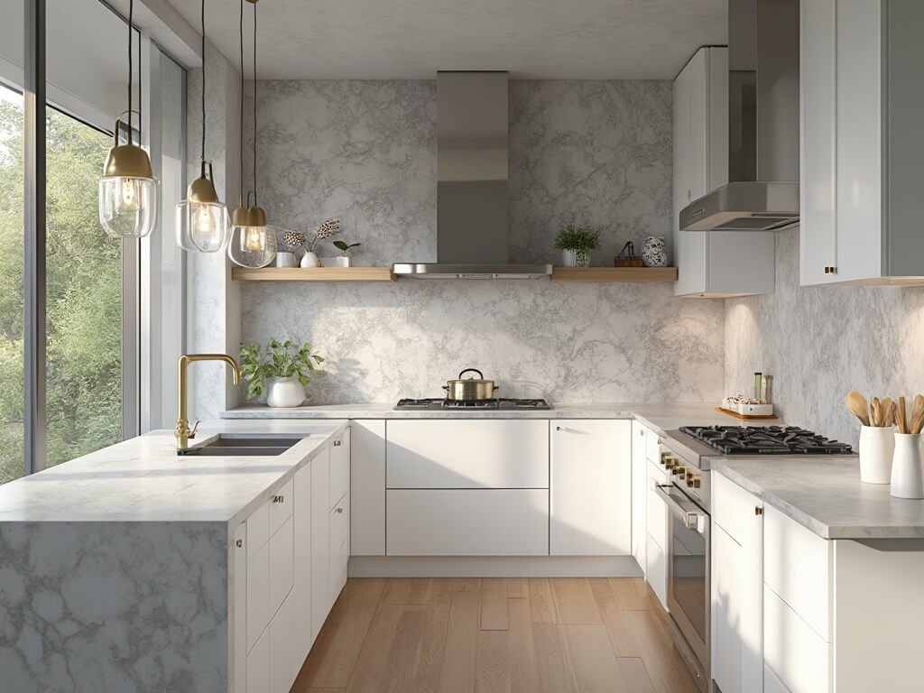
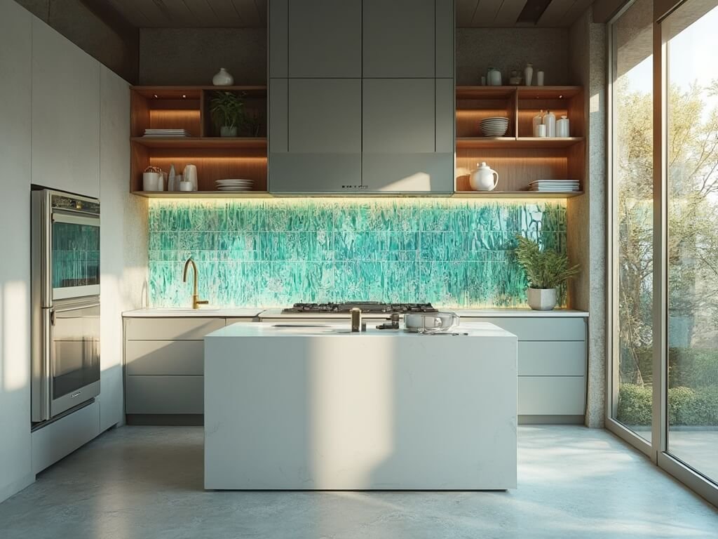
Picture this: A color that adapts to your kitchen’s personality. Pale Oak (Benjamin Moore OC-20) does exactly that. It’s not just gray. It’s not just beige. It’s a chameleon of sophistication.
Lighting Dynamics
- North-Facing Kitchens: Maintains warmth
- South-Facing Spaces: Bright and airy
- Artificial Light: Stays consistently inviting
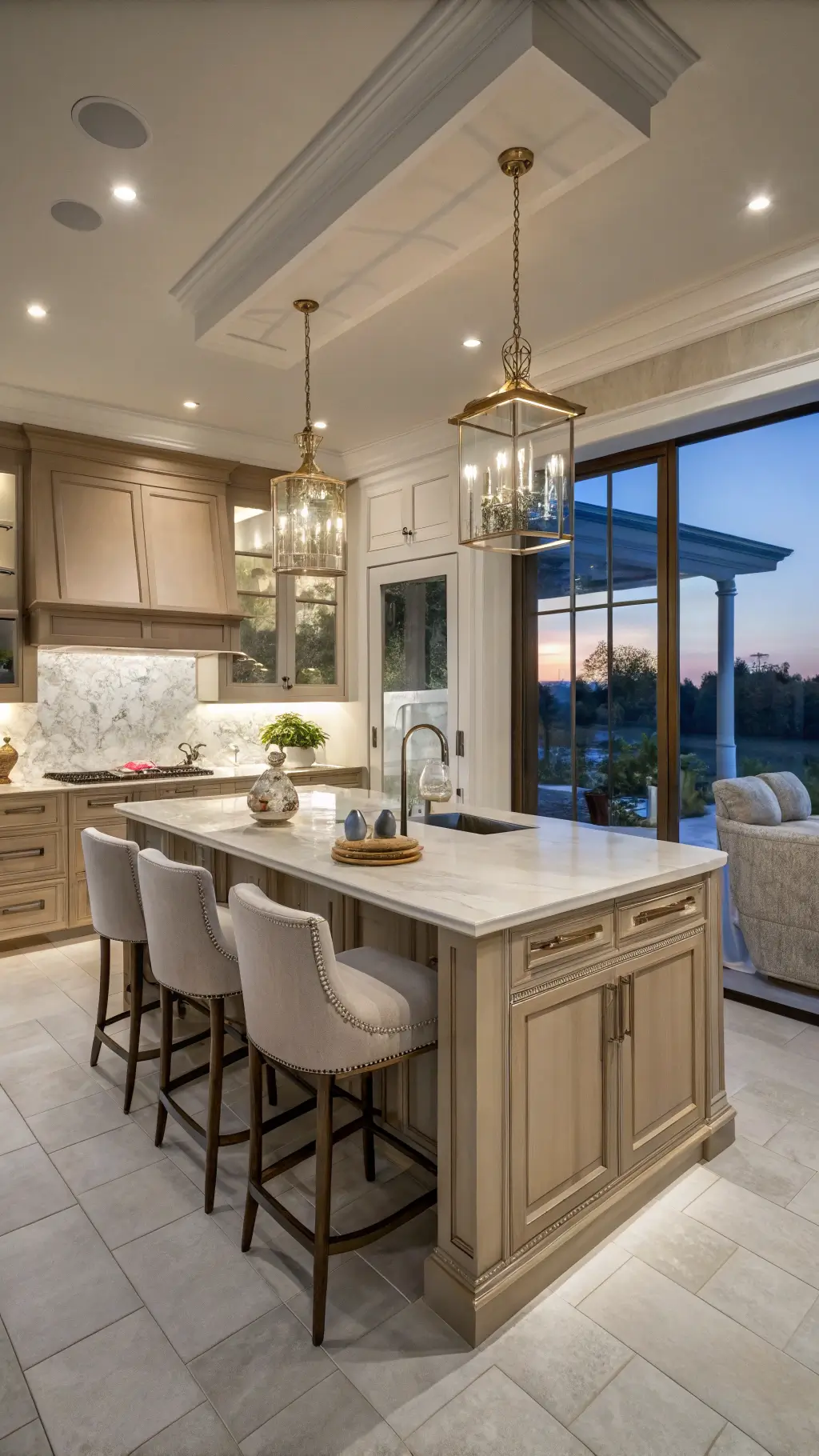
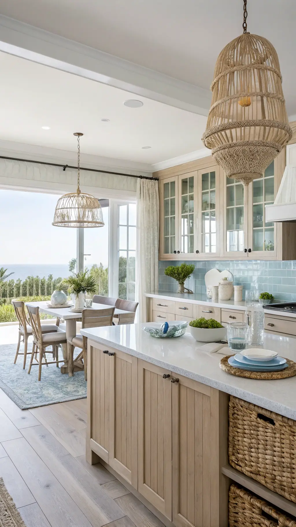
Design Pairings That Sing
Countertop Companions
- Taj Mahal quartzite
- Creamy quartz
- Soft marble tones
Hardware Heaven
- Brass pulls
- Aged bronze knobs
- Matte black accents
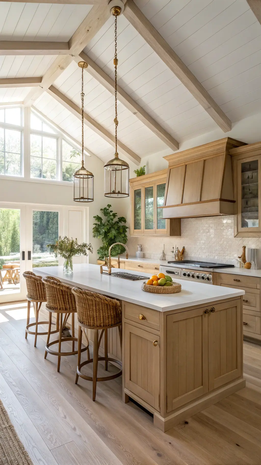
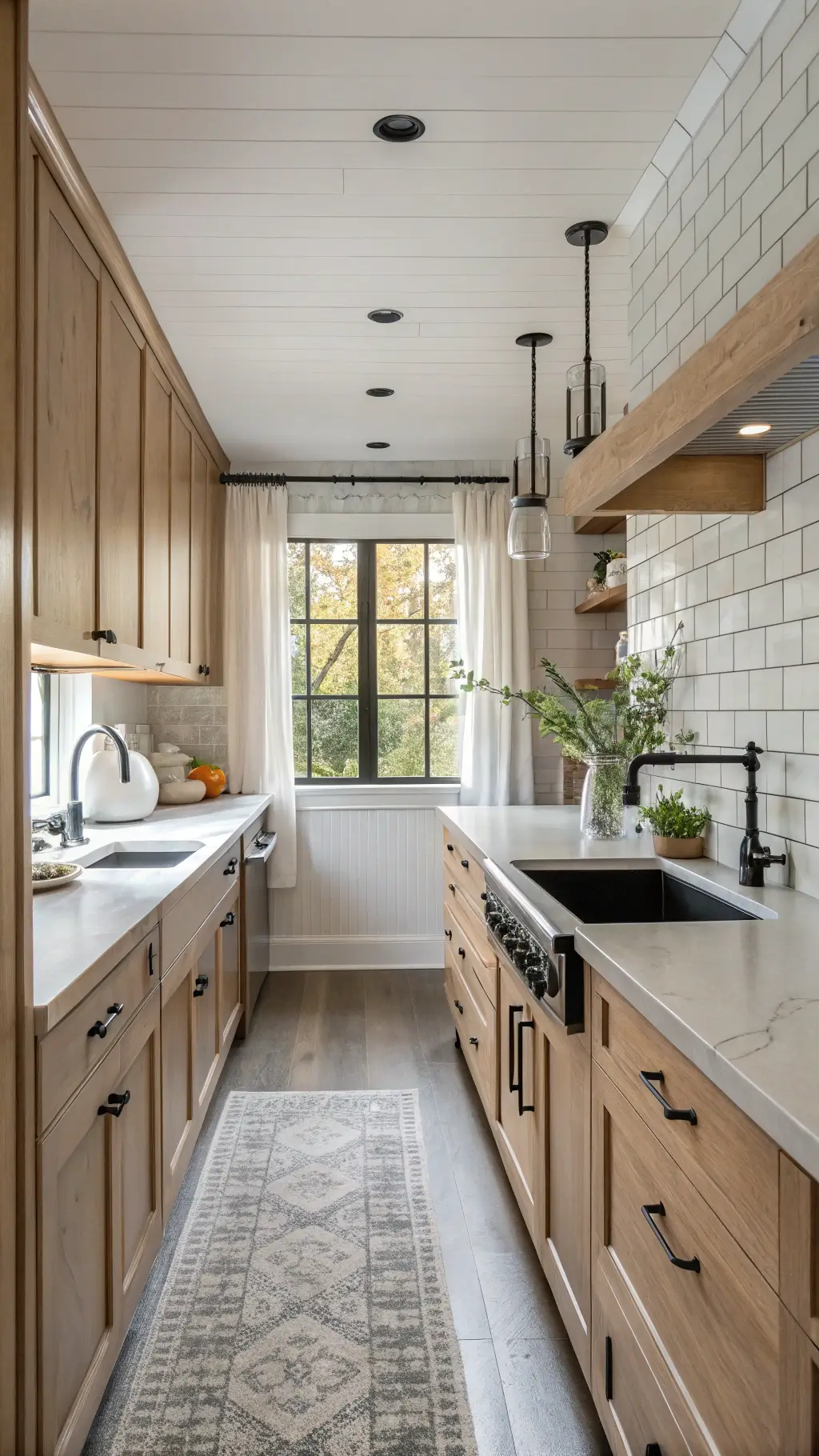
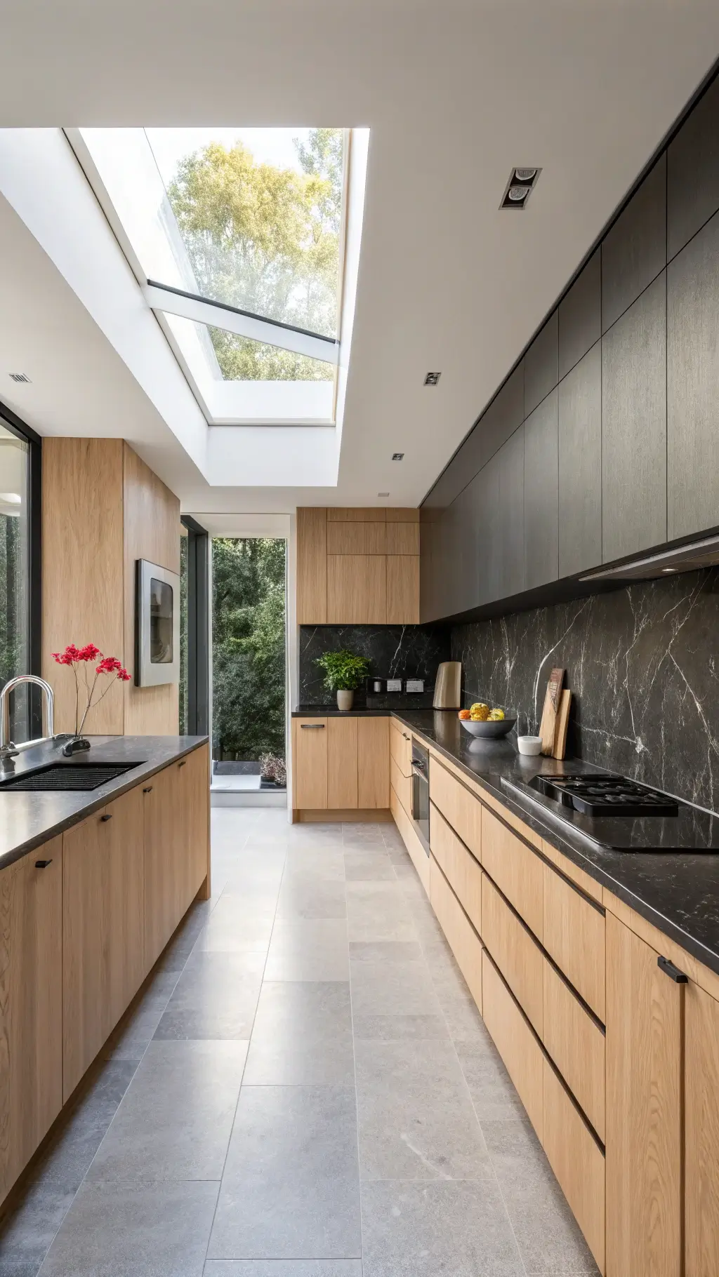
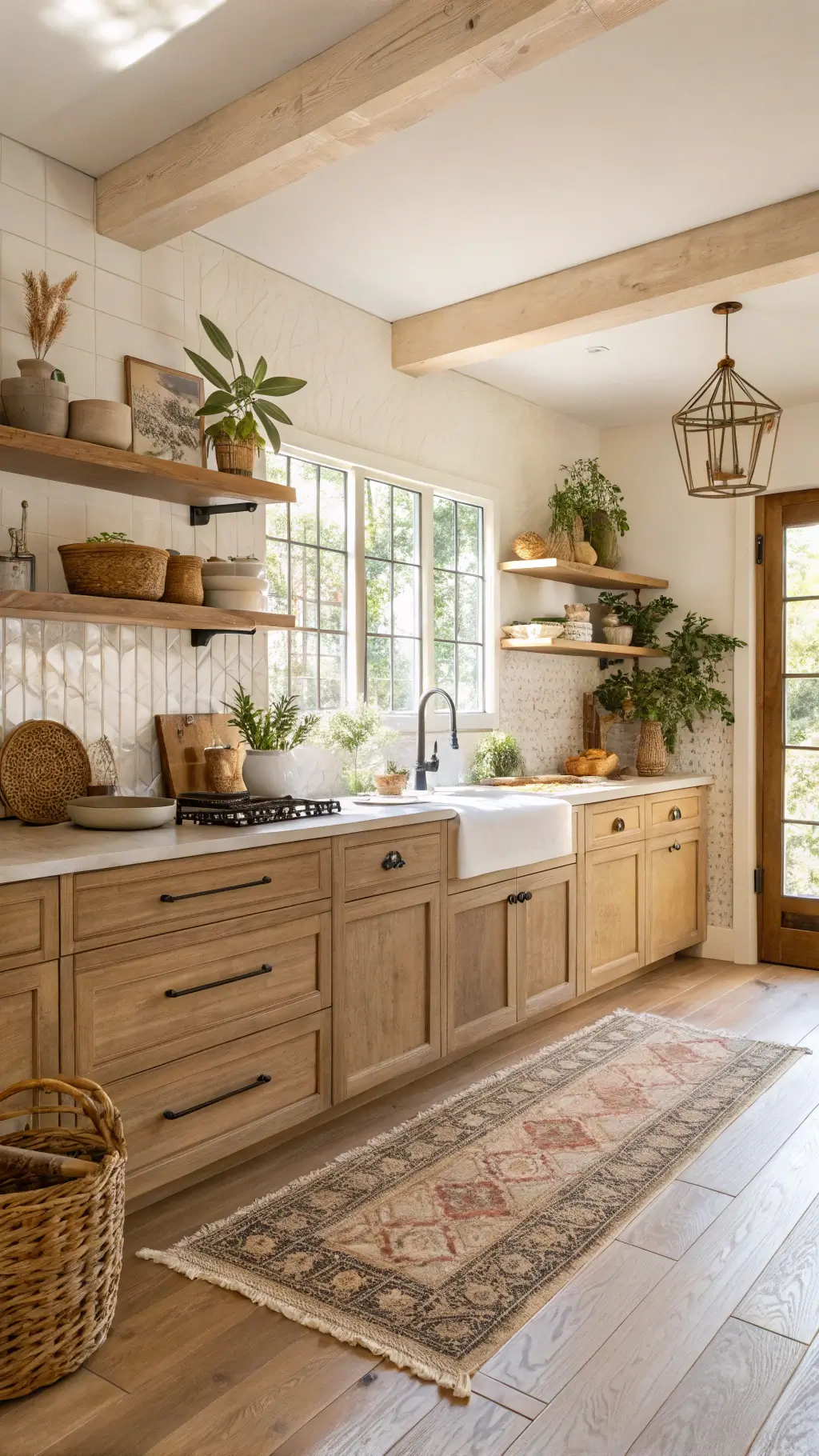
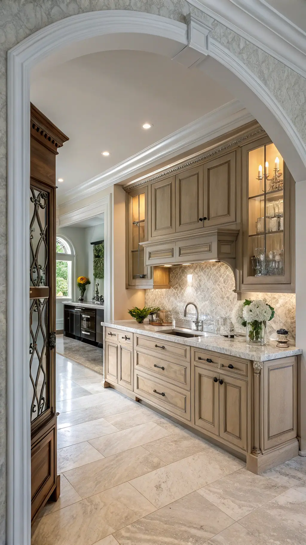
Style Flexibility: One Color, Infinite Personalities
| Design Style | Pale Oak Compatibility | Pro Tip |
|---|---|---|
| Modern | ✓ | Minimal hardware |
| Farmhouse | ✓ | Rustic open shelving |
| Transitional | ✓ | Layer textures |
| Bohemian | ✓ | Add organic elements |
Real-World Styling Secrets
Quick Wins:
- Add texture with woven trays
- Introduce herb plants
- Use warm white lighting
- Layer subtle textiles
Potential Pitfalls (And How to Avoid Them)
Watch Out For:
- Extreme lighting variations
- Clashing with cool-toned grays
- Forgetting to test paint samples
Pro Installation Tips
- Always test vertical paint samples
- Consider professional color consultation
- Use high-quality, durable paint
- Ensure proper kitchen ventilation during painting
The Financial Perspective
Pale oak isn’t just beautiful—it’s smart:
- Increases home resale value
- Timeless appeal
- Hides minor imperfections
- Works across design trends
Final Thoughts: More Than Just a Color
Pale oak kitchen cabinets are your design passport. They’re not just a color choice—they’re a lifestyle statement. Warm, adaptable, and endlessly chic.
Pro Tip: Your kitchen tells a story. Make sure Pale Oak helps you tell yours beautifully.